The Multi-Page Form
Note: These features are part of the Visforms Subscription and are not included in the free Visforms version.
For a better understanding, we recommend reading the documentation completely and using the
Section Introduction
to start.
Relationships explained in earlier sections of the documentation are not repeated here.
Multi-page forms use “New Page” fields
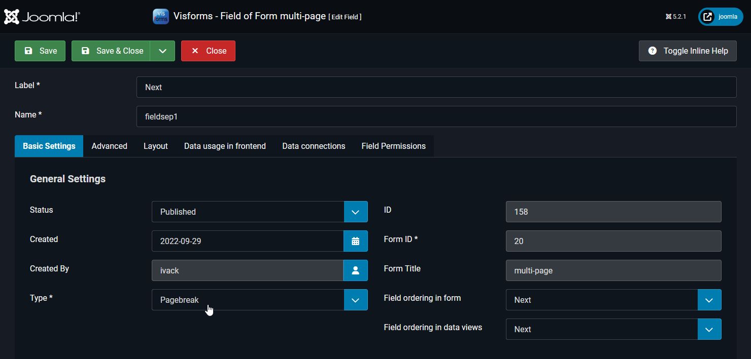
You can add any number of pages to any form. This is done simply by inserting a New Page field into the form. Position the field in the field order at the location where you want the page break to be inserted. The Label option of the New Page field is used as the text for the button that leads to the next page. Just like you know from the Submit button and Reset button.

Options for Multi-Page Forms
You can choose between the following two display formats for multiple pages:
- Multiple Pages (default value),
- Accordion.
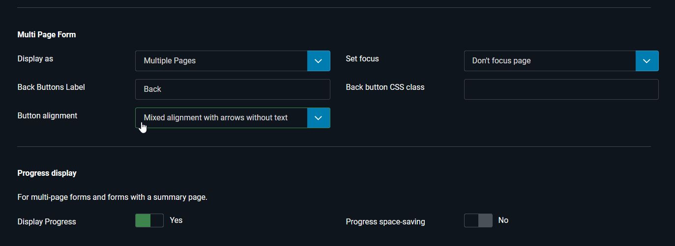
To display a multi-page form, the Display as parameter must be set to Multiple Pages, which is also the default value:
- Form Configuration » Tab: Advanced » Sub-Tab: Layout
Group: Multi-Page Forms » Parameter Display as = ‘Multiple Pages’
You can specify your own text for the back buttons. If you leave this option blank, the default text Back will be used.
Use the CSS Class for Back Button option if custom styling of the back buttons is required.
You can specify whether the user’s progress is displayed. If you display your form in a module in a small space, for example, you can minimize the text in the progress bar to save space (see below).

Visforms adds this automatically
Visforms automatically displays a Back button starting on the second page. If you have set the Summary Page parameter to Yes, Visforms adds a summary page to the form. Visforms then automatically displays a Review button on the last form page with fields, which leads to the summary page. Visforms offers numerous ways to configure the summary page and, in particular, the buttons involved in the following areas:
- Form Configuration » Tab: Advanced » Sub-Tab: Layout
Group: Multi-Page Forms
Group: Progress Indicator
The buttons of the multi-page form
The following buttons are part of the multi-page form:
- Next button:
It navigates forward to the next page.
It is created by inserting the New Page field type into the form.
The button text corresponds to the form field label:- Field Configuration
Parameter: Label = ‘My Next’.
- Field Configuration
- Back button:
It navigates back to the previous page.
It is created by inserting the New Page field type into the form.
The button text corresponds to the following setting in the form:- Form Configuration » Tab: Advanced » Sub-Tab: Layout
Group: Multi-Page Forms » Parameter: Back Button Text = ‘My Back’.
- Form Configuration » Tab: Advanced » Sub-Tab: Layout
- Review button:
This navigates you to the summary page with a table overview of all entries for easier review.
It is automatically inserted if the Summary Page option is enabled.
The button text corresponds to the following setting in the form:- Form Configuration » Tab: Advanced » Sub-Tab: Layout
Group: Summary Page » Parameter: Review Button Text = ‘My Review’.
- Form Configuration » Tab: Advanced » Sub-Tab: Layout
- Change button:
This navigates you back from the summary page to the last input page with form fields.
It is automatically inserted if the Summary Page option is enabled.
The button text corresponds to the following setting in the form:- Form Configuration » Tab: Advanced » Sub-Tab: Layout
Group: Summary Page » Parameter: Change Button Text = ‘My Change’.
- Form Configuration » Tab: Advanced » Sub-Tab: Layout
- Submit, Image Submit, and Reset Buttons
These buttons submit or reset the form data.
They are created by inserting one of the field types Submit-Button, Image Submit-Button, or Reset-Button into the form.- For the Submit and Reset buttons, the button text corresponds to the form field label:
- Field configuration
Parameter: Label = ‘My Submit’.
Parameter: Label = ‘My Reset’.
- Field configuration
- The Image Submit-Button is a form field of the same type and does not display button text, but rather the image stored for it in the field configuration:
- Field Configuration » Tab: Basic Settings
Group: Image Submit-Button Settings » Parameter: Select Image = ‘My Image File Path’.
- Field Configuration » Tab: Basic Settings
- For the Submit and Reset buttons, the button text corresponds to the form field label:
Focusing the form after switching to a new page
You can specify whether and how the form is focused after switching to a new page.
This applies to both forward and backward switching.
Do not focus page
After switching to a new page, the form does not scroll. If the individual pages of the form are very different in length, the user may only see a white area of the page. If the individual pages of the form are approximately the same length, the bottom edge of the form is always clearly visible in the viewport.
Focus on top of page
After switching to a new page, the page scrolls up far enough so that the first form field on the page is clearly visible. The first form field on the page is then at the top of the viewport.
Focus on bottom of page
After switching to a new page, the page scrolls down far enough so that the bottommost form field on the page is clearly visible. The bottom-most form field on the page is then located approximately in the middle of the viewport.

An example form
An example of a multi-page form can be found here: Multi-page form.