CSS examples part 1 for solving requirements with the Frontend Web Assets
Note: These features are part of the Visforms Subscription and are not included in the free Visforms version.
Design field labels of radio fields and their options individually
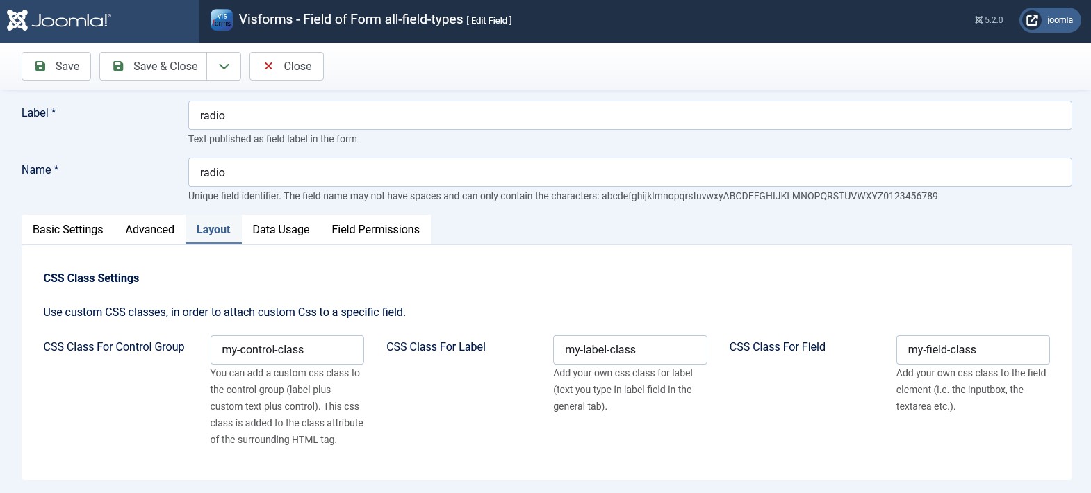
There are 3 places for which you can set your own CSS classes for form fields:
- Option CSS class control group
- Option CSS class for label
- Option CSS class of the field
These 3 places serve as convenient anchors or entry points for your CSS selectors. All HTML elements next to or below these entry points can be addressed with any degree of precision using CSS selectors and their appearance can be changed.
Requirements
The example was created with the following context.
The following settings were active in the Joomla configuration:
- Frontend Template = Cassiopeia
The following settings were active in the form configuration, tab Advanced, group Layout:
- Option UI Framework = Bootstrap 5
- Option Sublayout = Horizontal
The radio field
In the case of the radio field, the radio field and all of its radio field options have a label in the form of a <label> element. The custom CSS classes from the CSS class of the field option end up in the class attribute of all labels, i.e. all <label> elements. The radio field label and radio field options label are therefore given the same custom CSS class.
The radio field in the form

Field configuration, “Layout” tab

Form configuration, “Frontend Webassets” tab

The CSS code
In the following CSS, CSS selectors are used to distinguish between the following label groups for a radio field as an example:
- The field label and all option labels (bold).
- Only the field label (blue).
- All option labels (italic).
- Label of the first option (red).
- Label of the further option (orange).
- Label of the third option (green).
/* field label and all input-button labels */
.my-label-class {
	font-weight: bold;
}
/* field label */
.form-group > .my-label-class {
	color: blue;
}
/* input-button label: all options */
.form-check-label.my-label-class {
	font-style: italic;
}
/* input-button label: first option */
.my-control-class .form-check:nth-of-type(1) .my-label-class {
	color: red;
}
/* input-button label: second option */
.my-control-class .form-check:nth-of-type(2) .my-label-class {
	color: orange;
}
/* input-button label: third option */
.my-control-class .form-check:nth-of-type(3) .my-label-class {
	color: green;
}
Comments
There are many other options for these CSS selectors, all of which achieve the same thing. The different options differ in terms of taste, habit, experience, complexity and possible side effects.
It would even work without your own CSS classes. The alternative would be to simply use the field ID directly in the selector. With your own CSS classes, however, the CSS selectors are usually much simpler.
The same applies, of course, to the <input> elements of the radio field and all other areas of the field. You just have to take a closer look at the HTML/CSS structure to see what is possible.